Da Bright Lifestyle
Da Bright Lifestyle (commonly referred to as DBL) is a non-profit organisation that works with young people and families in the community. DBL’s values are rooted in the Christian faith, inspired by 1 Samuel 16:7 – “The Lord does not look at the things people look at. The Lord looks at the heart.”
DBL's motto is “working from the inside out.” They believe that true transformation begins within, and their hope is that each person we work with experiences this change, so they can live a fruitful and purposeful life.
One of their greatest burdens is seeing so many young people and adults who do not recognise their potential, their power, or the beauty within them. Too often, this is because the life inside them feels dormant, unawakened and not overflowing with the vibrancy it was created to have.
Brief & design process:
DBL already had established branding, but they felt it had become outdated. They wanted a rebrand that would feel more modern and youthful, resonating with their younger audience. While refreshing the look, they also wanted to keep their iconic yellow, as it reflects their values of living a bright life, bringing joy, and offering hope. The goal of the rebrand was to ensure the organisation felt approachable, welcoming, and loving.
Service
Logo Design & Branding
Client
Da Bright Lifestyle
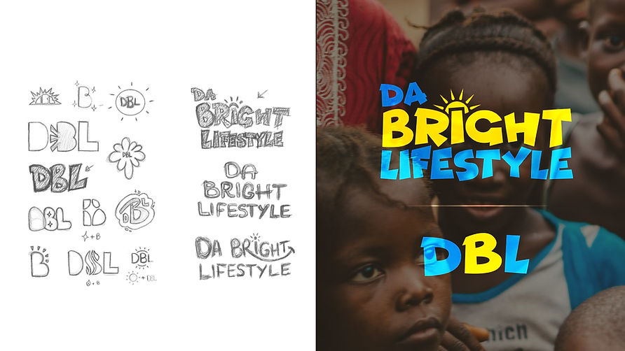
Upon reading the brief, the keywords that stood out to me were bright, hope, and joy. I wanted the new logo to capture these qualities through both colour and typography, while also resonating with DBL’s core audience: young people. The concept of living a bright life immediately brought to mind the sun, an image that symbolises light, warmth, life, and hope. This made it a natural choice to incorporate a shining sun as part of the logo.
For typography, I aimed for something youthful, playful, yet modern. I selected the Funhouse sans-serif typeface coupled with Montserrat, which reflects these qualities and aligns with the brand’s direction. To create a distinct visual identity, I also used the initials “DBL” as the logo’s icon. The colour palette retains DBL’s signature yellow, representing brightness and joy, while introducing 2 complementary shades of blue & pink to enhance vibrancy and energy.
Together, these elements formed the foundation of DBL’s refreshed identity, modern, approachable, and full of life.


'Working from the inside out...'


