Blackbird Business Continuity Group
At Blackbird Business Continuity Group, They bring the vigilance, adaptability, and resilience needed to protect the most critical services from disruption.
Like the blackbird, always alert to its surroundings, quick to adapt, and steady through all seasons, they remain ready to anticipate change and respond decisively.
With proven expertise built over a decade, they operate to the highest standards of precision, compliance, and quality, ensuring our clients are ready to respond effectively, no matter the challenge.
They take pride in delivering practical solutions that work in the real world, not just on paper.
They design, implement, and maintain business continuity programmes that meet the most stringent operational and compliance requirements.
Brief & design process:
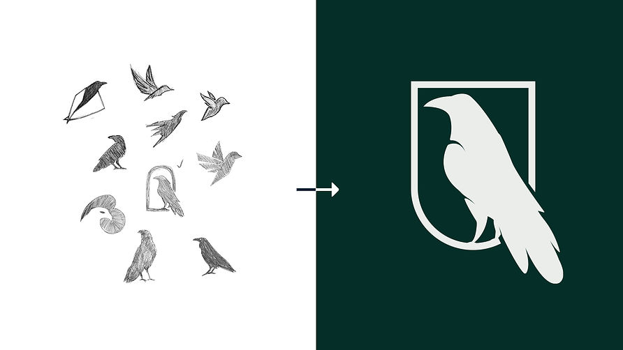
Blackbird Business Continuity Group approached me with a brief to design a logo and brand collateral that would capture their vision. The client already had a clear idea of direction: the logo should be centred around a blackbird, reflecting the qualities of alertness and adaptability. These traits mirror the organisation’s ethos—being constantly aware of its environment, anticipating change, and responding with decisive action.
For the colour scheme, the client requested something premium and sophisticated. To achieve this, I developed a palette based on varying shades of green, creating depth and consistency across applications. To complement the greens, black was introduced as a versatile neutral that pairs effectively with any colour, providing balance and flexibility.
From a psychological perspective, green is strongly associated with security, stability, and growth—qualities that align closely with the brand’s values. By using green as the dominant colour, the identity feels trustworthy, resilient, and adaptable across all touchpoints.
Service
Logo Design, Visual Identity
Client
BBCG

The company values, vigilance, adaptability, and resilience, were at the centre of the design process, but the word that stood out most was 'protect'. This led to using a shield in the logo, as a shield is a strong and simple symbol of safety and reliability.
The blackbird itself also plays an important role. Its pose was carefully chosen to look alert and watchful, showing the company’s commitment to vigilance. By bringing together the shield and the blackbird, the design reflects both protection and awareness. The result is a logo that clearly represents the company’s mission: keeping important services safe and secure.

Testimonial
"Top work!
I reached out to IKB Media a few weeks ago to help me shape my brand. I had a clear idea of what I wanted it to represent, the colours, the style, the overall feel. IKB Media really brought it all to life.
From the very first consultation, Kola took the time to really listen and draw out my ideas, story, and requirements. He came back with thoughtful draft designs, each explained with the reasoning behind the choices he made. That level of care made it so much easier to trust the process.
Bringing your vision to life can feel daunting, but IKB Media made it feel smooth and collaborative. Their clear process takes you step by step. From articulating your ideas to delivering a polished, finished product. I couldn’t be happier with the result!" - Tosin, Founder


