Bridging Silent Dialogues
BSD aims to bridge societal divides by providing a platform for marginalised voices, including individuals experiencing homelessness, struggling with addiction (alcohol, drugs, or gambling), and facing a variety of mental health challenges.
Through candid storytelling and empathetic interviews, we seek to foster understanding, empathy, and connection within our community. By amplifying these often-overlooked perspectives, we aspire to inspire compassion, drive positive change, and cultivate a more inclusive society where everyone’s story is valued and heard.
The Design Process:
Bridging Silent Dialogues required a logo that visually represented their role as a bridge for marginalised voices to be heard. The core brand keyword identified was ‘bridge,’ which guided the design direction.
Service
Logo Design, Branding
Client
BSD

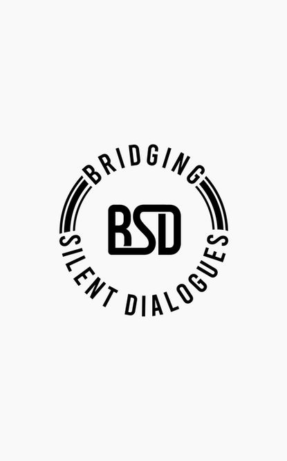
To avoid a literal depiction, the decision was made to use the acronym as the foundation of the logo. This allowed for a subtle integration of the bridge concept.
The letter ‘S’ served as the key design element: its curved form mirrors the flow of a winding bridge from a bird’s-eye perspective.
By visually connecting the ‘B’ and the ‘D,’ the composition reinforces the illusion of a bridge, aligning the logo with the organization’s mission in a minimal yet meaningful way.


Monochrome
The colour palette was deliberately kept monochrome, using black and white to establish a timeless and neutral aesthetic. This choice not only aligns with the organisation’s serious subject matter but also ensures that the focus remains on the stories of the interviewees, rather than being influenced by colour.


